
In the second installation of our competitive pricing series, Dan Cakora, Business Consultant at Vendavo illustrates how to build a comprehensive market view of competitive prices to help you best position the price and value of your products in the market.
Recently, one of my customers in the chemicals industry wanted advice on how to collect, analyze, and visualize competitive price data.
If you haven’t had a chance to read that article, start there to get a better understanding of what data sets you should collect, how to compute price differences, and how to visualize price trends. But surely, you’ll have more questions like:
- What’s the best way to see multiple competitors at once?
- How do I know which data points are important to me?
- Can I learn anything else about my competitive positioning in the market?
The following visualization begins to answer those questions and more:
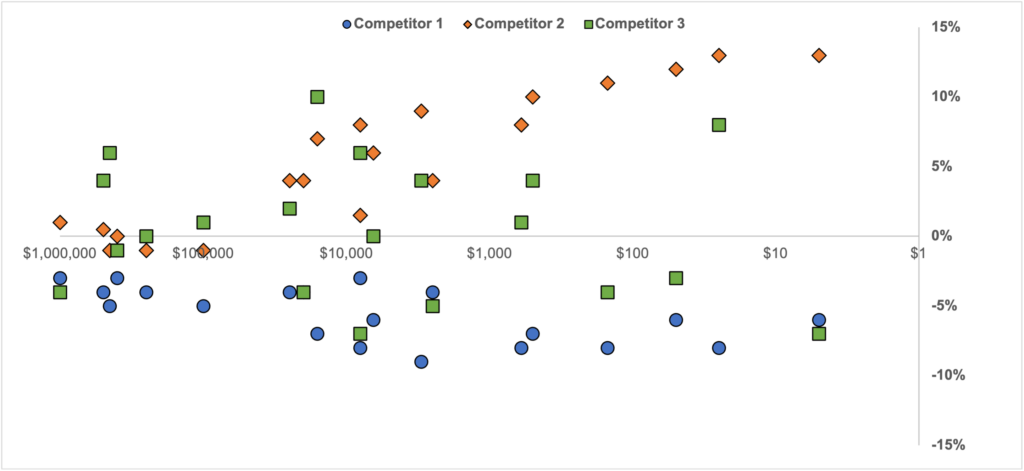
In this article I will unpack each data element, illustrate how to construct the visualization, and most importantly, provide advice on how to interpret it.
First, let’s define the elements of the chart.
Dot: The dot represents the competitor-SKU combination. A robust scraping operation will capture prices of multiple SKUs from multiple competitors to create a holistic view of the market.
X-Axis: The X-Axis represents your sales. Put another way, this represents how important a given SKU is to you. I’ve made two tweaks to the x-axis: it’s a logarithmic scale, and the axis is reversed from left to right. I’ll explain the “why” later in the article.
Y-Axis: The Y-Axis is your price delta between your price and your competitor’s price on the equivalent SKU. As we did in the previous article, we’ll use the equation of [(Competitor Price)/(My Price)-1]*100%. When we chart the data, the intuition becomes:
- Dots ABOVE the x-axis mean that the competition is priced ABOVE me.
- Dots BELOW the x-axis mean that the competition is priced BELOW me.
- Dots ON the x-axis mean that the competition is priced EQUAL to me.
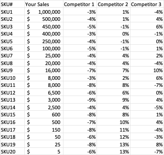
For those of you who prefer to look at data in a table, here’s a sample format:
Now that we understand the data, let’s break down the chart by competitor so we can understand how to interpret the visualization.
Competitor 1: Generally Priced Lower
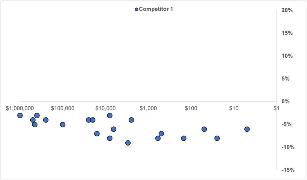
In the visualization above, Competitor 1 generally prices below me. This is true across the board; from SKUs I sell a lot of to SKUs that I don’t sell frequently.
There could be various reasons for this price delta including:
- The competition could be a new entrant or fighter brand that needs a lower price to be relevant
- They may be using a different channel that supports a lower price (think catalog vs. ecommerce)
- You offer a value above price that justifies a premium price
Understanding these soft factors will guide your response (or lack thereof) to this competitor.
Competitor 2: On Par, Until Not
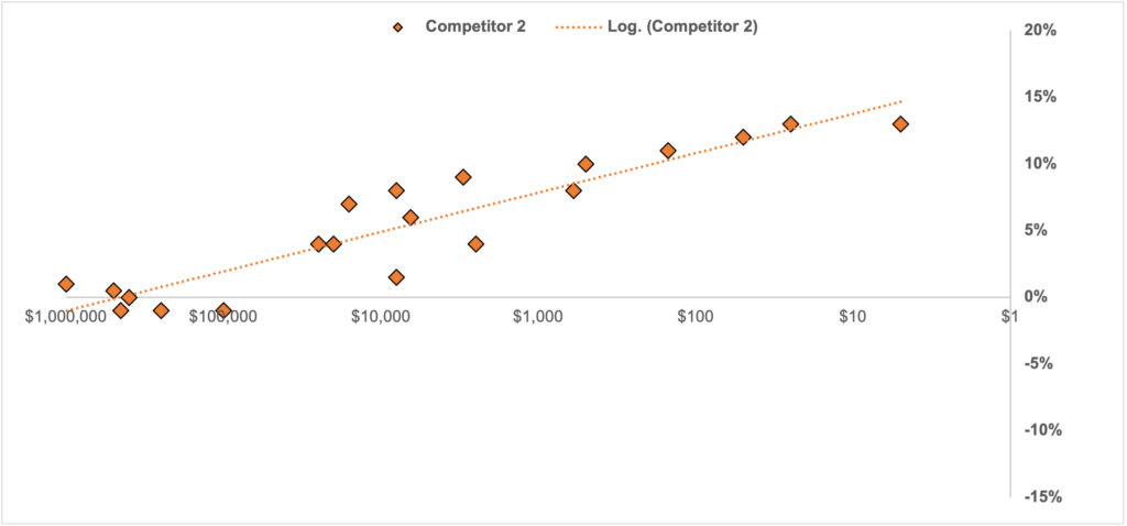
Competitor 2 exhibits a very different market position. For SKUs that I sell a lot of, the competition is within +/- 1% of my price. Because the sales are high and there are many buyers, this product must be well-known, meaning there aren’t a lot of games that can be played with price on these SKUs.
However, as product sales drop off, we can see a clear trend where the competition charges more for “onesy-twosy” items that aren’t frequent purchases.
These are probably the tail of your product offer, so the price isn’t as “top of mind” for your purchasers. For these SKUs I may consider a price increase to capture some of the premium my competitor is charging.
Competitor 3: All Over the Place
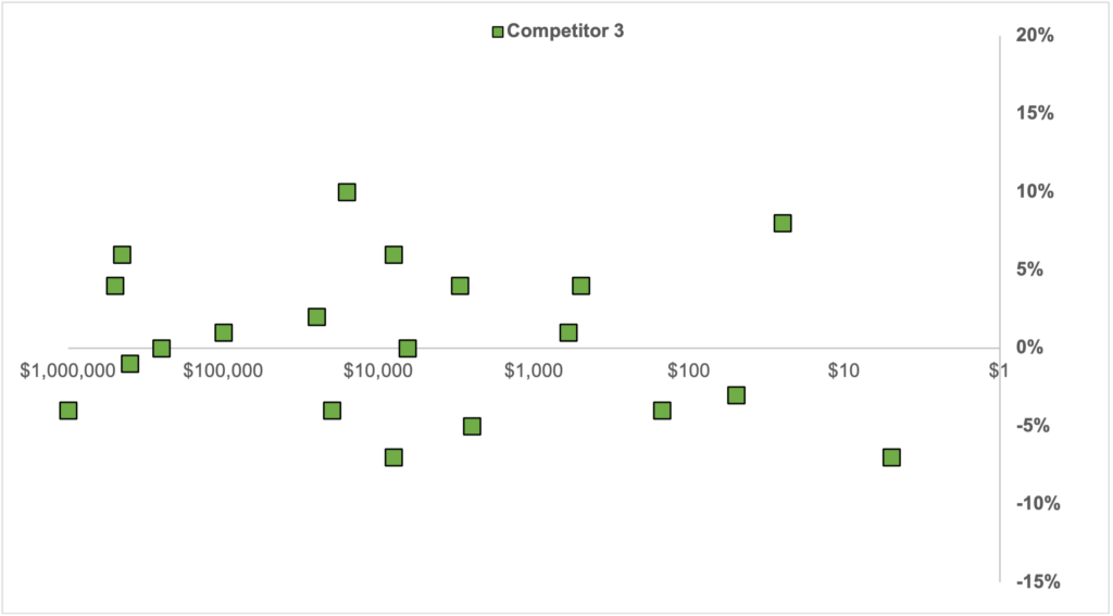
Competitor 3 is all over the place relative to my price. Sometimes they’re more expensive, sometimes less, and sometimes they are right on par.
The main takeaway is that Competitor 3 is likely competing on something other than price. Data from this competitor can still be useful when computing an upper and lower bound on your price, but I would take any broad inferences from their data with a grain of salt.
A Few Chart Tweaks: Earlier in the post I mentioned that I set the x-axis to a logarithmic scale and reversed the order (from left to right). Why did I do that?
I frequently see sales data that is skewed: a handful of “hero” SKUs with high sales, and many other SKUs that have low per unit sales but aggregate up to a decent amount. The hero SKUs tend to dominate the view when charting, so I use a logarithmic axis to keep visibility of the whole portfolio. Take a look at the logarithmic vs. standard axis comparison below:
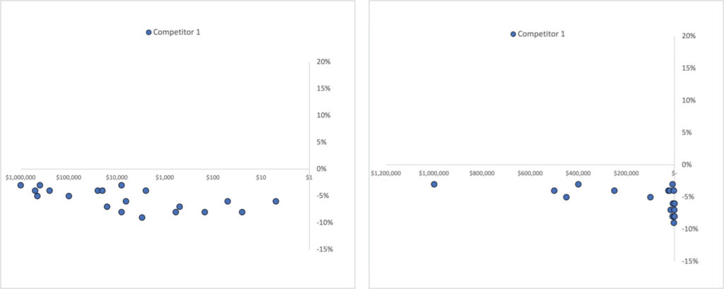
Many times, I will reverse the x-axis to show the SKUs with the largest sales to the left. Most of my audiences read from left to right, so the most important information in a chart or visualization should be on the left. This is an optional step, so if you prefer a standard axis (biggest sales to the right) then that’s a-ok.
Pulling It All Together

Now that I understand what each competitor is doing, it’s time to revisit the visualization as a whole. In general, I like where I’m priced on my most important SKUs. I’m close enough to Competitor 1 and Competitor 2 that my price is in the market. Competitor 3 is all over the place, so I don’t care as much.
Toward the tail end, it appears that there is an opportunity to close the gap with Competitor 2 to collect a premium. I’m not selling much of these SKUs anyway, so the risk of a backlash is low. Still, I’ll have to make sure I don’t get too far away from Competitors 1 and 3, otherwise I’ll fall out of market.
There’s a lot of complexity that goes into visualizing and interpreting competitive price data. Using this comprehensive market view approach, you’ll be able to make important decisions about how to price your products competitively. But if you need extra help, our team at Vendavo is always happy to lend a hand. Plus, solutions like Vendavo Pricepoint can help you execute straightforward, scalable price management across your organization.